...I have been designing and developing digital products and websites. I began as a web designer with PwC many years ago and have worked my way through the ranks to Lead UX Designer at The Walt Disney Company then in 2018 onto Senior UX Designer & team lead at Bilue , Sydney.
I have worked with companies within Finance, Healthcare, Communications & Technology, Manufacturing, Government, Education, Automotive, Hospitality and more.
I enjoy working with all stakeholders throughout the product development cycle, including:
...to help get from idea to solution:
I’m currently digging into:
Jeremy and I worked together throughout 2022 across a range of projects focused on user research, mapping and prototyping in the financial and insurance industries. During our time together Jeremy was also instrumental in researching, designing and developing several internal projects for Bilue spanning desktop, tablet and mobile interfaces.
Glen Jeffreys, Head of Design, Bilue
Jeremy's key strengths are UX research, user journey mapping, value propositions and personas, information architecture, prototyping and testing. Jeremy also has a refined eye when it comes to UI design and brand, making him a valuable addition to any product design team.
Jeremy has been a senior member of the Bilue design team for a number of years and has consistently delivered successful UX research and prototyping solutions across a number of corporate, NGO and government projects. As the icing on the cake, Jeremy is a wonderful colleague, well-liked by the entire design and development team thanks to his thoughtfulness, intelligence and humour.
I had the pleasure of working with Jeremy, as my role as Head of UX at Alliance Software. Jeremy is great to work with, has the perfect mentality for a UX designer. He is always looking for deeper human insight to build research driven solutions. This approach I feel is greatly needed in the industry, and I look forward to watching his career progress in the coming years.
Leigh Grey-Smith, Greytone Consulting
We brought Jeremy on as a Senior UX Designer to help shape our UX practice at Prismatik. Jeremy did a fantastic job and quickly laid down a pragmatic and effective set of practices that we were able to incorporate into our product delivery processes. Jeremy has a sharp mind and was personable, hard-working, reliable and mature. I can't recommend him highly enough.
Rob Morris, Managing Director, Prismatik Sydney
Committed to his work, Jeremy has an outstanding passion in the UX and Design field showing great initiative in what he does. Would absolutely love to work with him again
Robinson Lam, Freelance Digital Designer
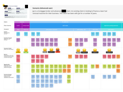
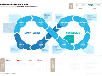
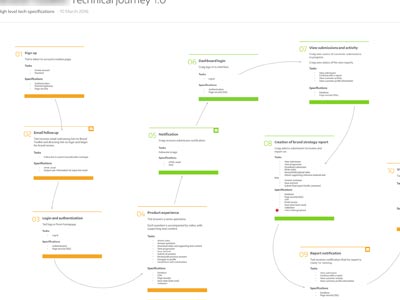
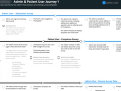
Due to NDAs, illectual property and the like I'm restricted from showing much of my work, however the below samples should illustrate fairly well the type of work I produce. Examples blurred or redacted where required.
Below is a selection of projects I've worked on over the years that outlines how I went about understanding and solving the problem. More to come soon.
NRMA Insurance's mobile app was about to undergo a range of updates as laid out in the company's roadmap, however there was concern with the already growing number of onboarding screens within the app and the amount they might grow by as new products & features were added. My task was to explore opportunities to better onboard new users to the app, as well as introduce these new products & services to existing users.
NRMA has a new roadmap of products & features due to roll out over the coming 24 months which they need to be able to introduce to new & existing users of their app, however the current method for doing this means that onboarding screens are growing significantly and thus acting as a barrier to users being able to achieve specific tasks. For example, the initial state of the app I was working with had up to 11 screens of onboarding before a customer could use it.
All users of the app, including new and existing ones.
I was lead UX Researcher on the project, with internal support from the UX Lead as well as other experienced internal designers.
This was an open-ended exploration, however there was little appetite for the introduction of new components into the app, so re-use or modification of existing components was encouraged.
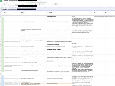
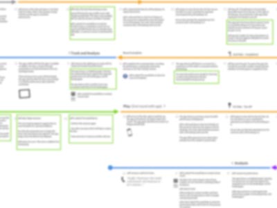
As is often the case, I began with a UX Lean Canvas to help me understand the project at a high-level. Next, I conducted an exploration of the current state of the iOS app in order to help empathise with users and understand what I may have to work with component-wise, followed by research and playback of the most common onboarding methodologies. Next, I began to explore ways in which different onboarding methods might play a part in helping reduce friction, as well as mapping out things like user journeys which would act as evidence when proposing new ideas back to the business. Finally, a set of task flows and wireframes, reusing existing components in different ways led to a implementation matrix which would act as a guide for other designers on the team for future mobile app releases.
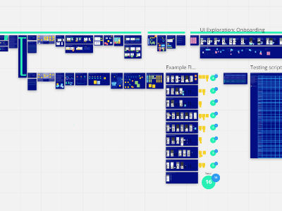
The large research piece, presented back to the team as a narrative Miro board, was very well received and both confirmed existing hypothesis within the team as well as being a document that would guide future decisions around onboarding new and exisiting users.
The NRMA Insurance app as it stood when I first began this project was reasonably basic insofar as products & features within it were essentially siloed and users were often left with no other options to further explore the app from the end of any given journey. The business also lacked the opportunity to present products & services to users in timely & relevant ways throughout the app. The principle goal of this stream of work was to encourage user engagement with products, services and features available from within the NRMA insurance app.

The project's problem was twofold: firstly, users were constantly left at deadends within the app, with no obvious opportunities to explore related or suggested products or services, and secondly, the business had no method for planning out and introducing products & services that users might be interested in at key moments within a customer's journey.
All existing NRMA Insurance customers currently using, or likely in the future to use the app.

I was Lead UX Designer on the project, with internal support from the Head of UX as well as other experienced internal designers.
Resources and budget dictated that any near-term solutions had to employ only existing mobile app components, however internal stakeholders (design team) were keen to see an exploration of what future states might look like.
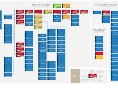
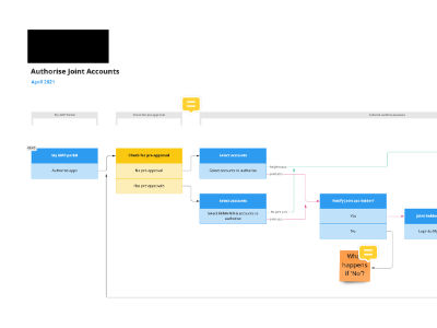
To help align myself with internal stakeholders at NRMA, I roughed out a UX Lean Canvas. Next, some desktop research was done around engagement methodologies (including methods such as the "Product-led Growth" lifecycle). An examination of the roadmap for upcoming features was looked at next to understand which products & services will be added to the app in the near-term. A basic IA of the current app was created, and at the same time, with the help of NRMA Product Owners, relationships between the different areas of the current-state app were mapped out. The end goal was to be able to test out relationships between areas of the app with users, and so firstly, some user journey exploration was mapped out as well as a basic feature interconnectivity plan, which could be presented back to internal stakeholders for validation. The final phase included creating a number of high fidelity prototypes based on the interconnectivity plan (8 in total) which were tested with existing NRMA Insurance customers (8 in total, fully remote, using Figma prototypes) for further validation.
The user testing provided validation for my hypothesis around both the appetite of users to be presented with related or interesting options for further exploration within the app as well as the core concept of preventing deadends with the app.